Mascot design

Strategic positioning in a dynamic market.
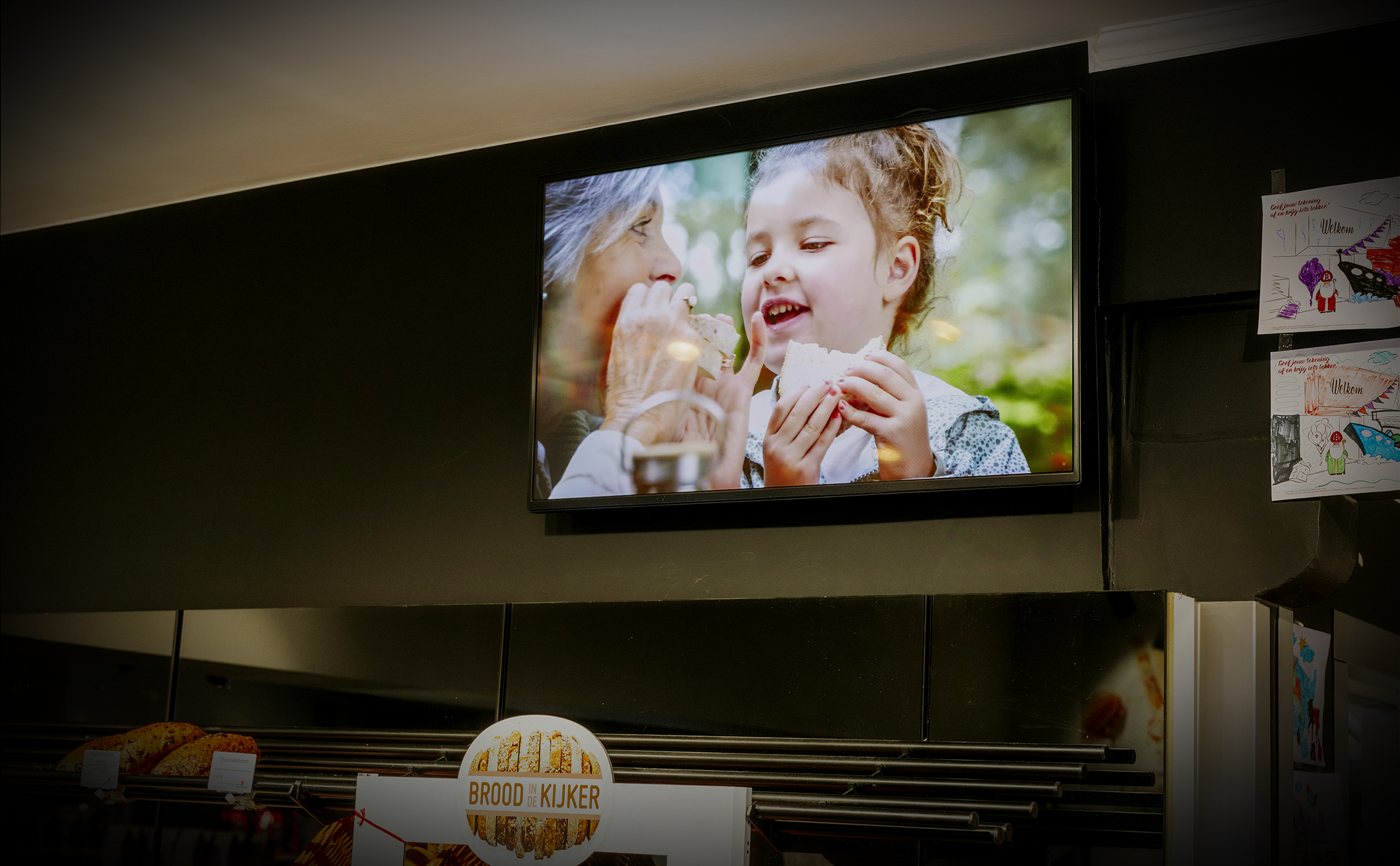
Aernoudt Bakery has been a household name in East and West Flanders for decades. With more than forty branches, they are well known in the region for their delicious traditional quality products such as bread, gingerbread, ice cream and patisserie. For a clear positioning within the market, Aernoudt needed to return to its roots: the artisanal bakery, always nearby. The Communicationhouse helped translate this strategic vision into various strategic campaigns in which we emphasized Aernoudt's proximity in online, offline, textual and visual elements for both the B2B and B2C sectors.
Aernoudt: Always nearby, always available/
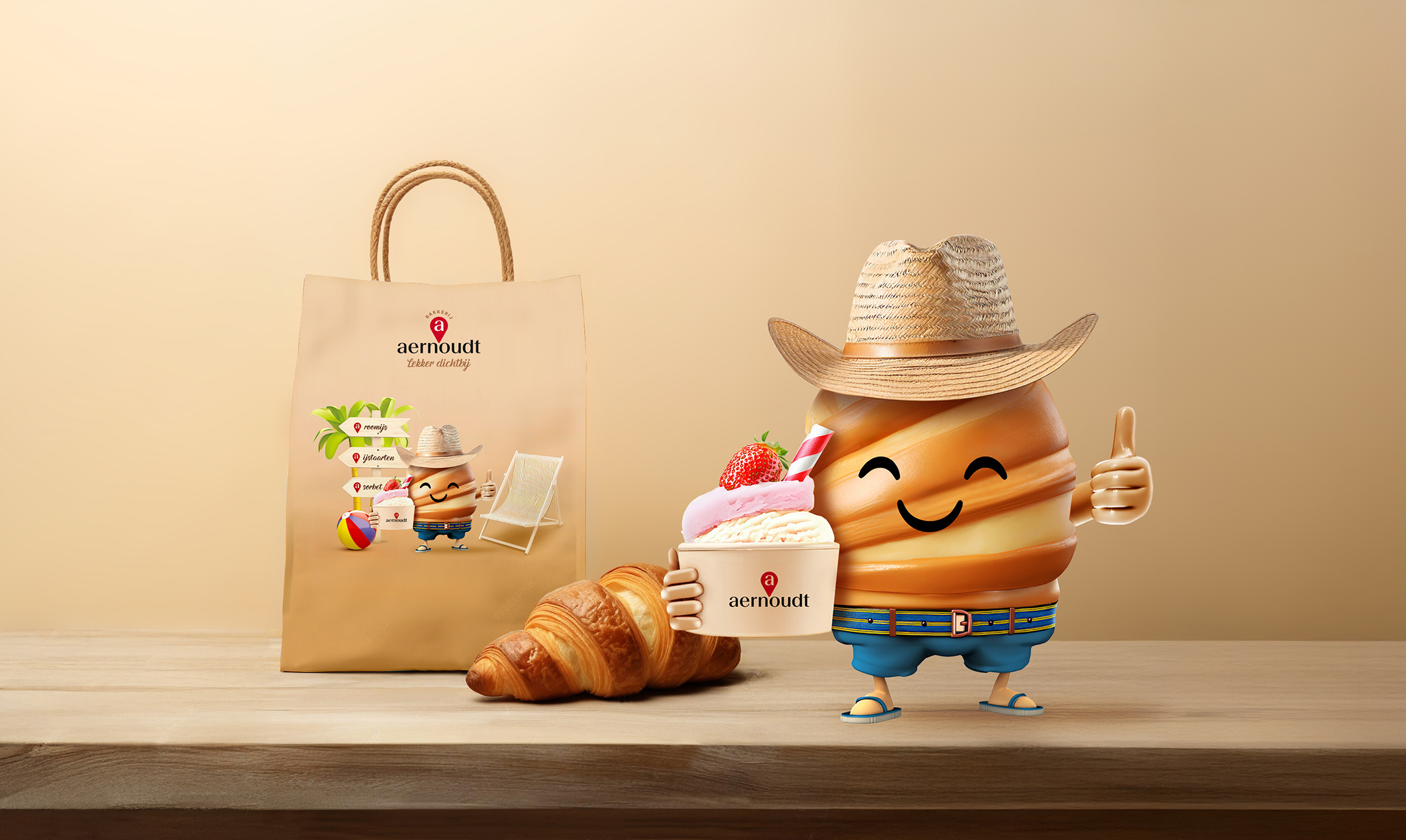
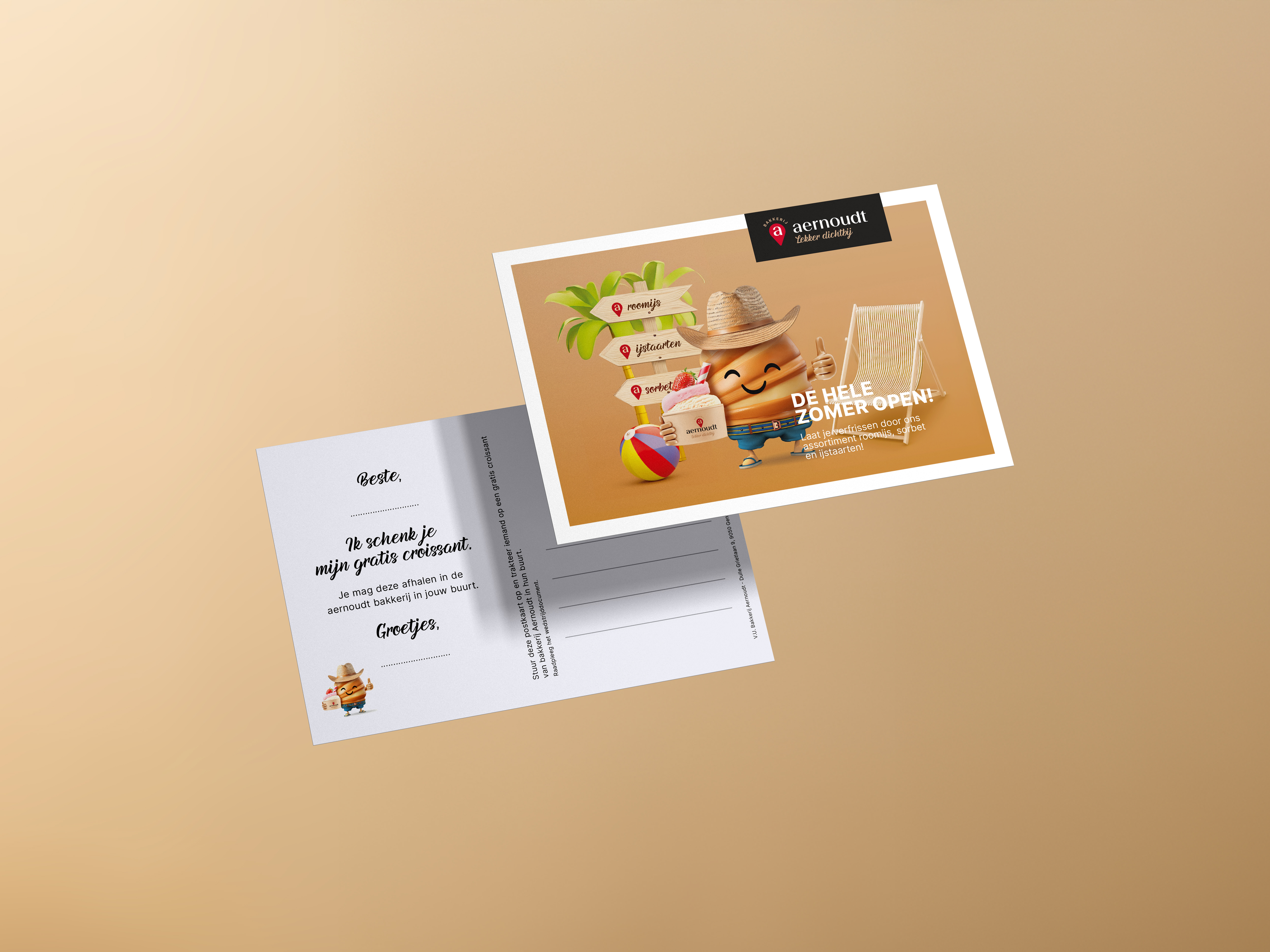
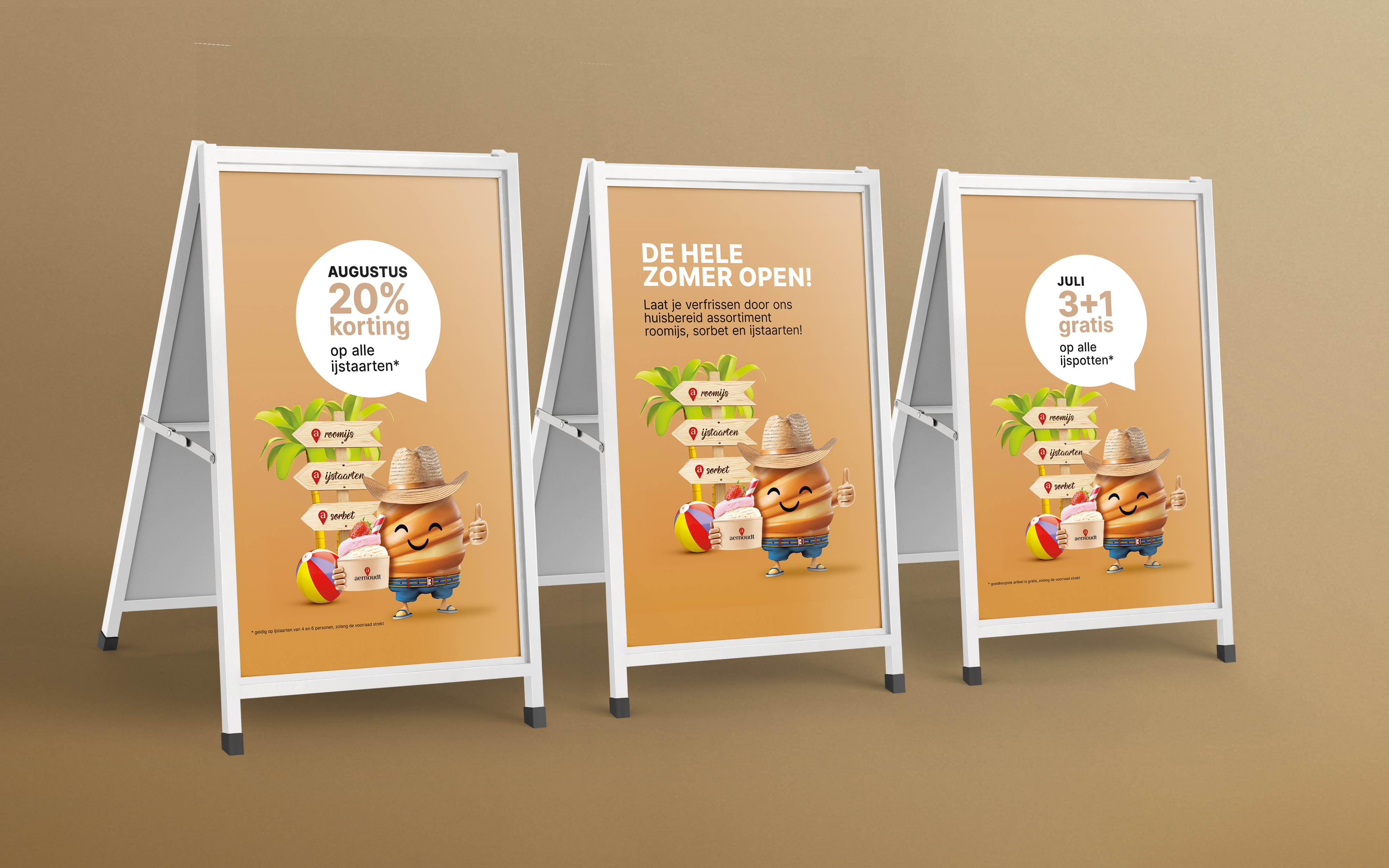
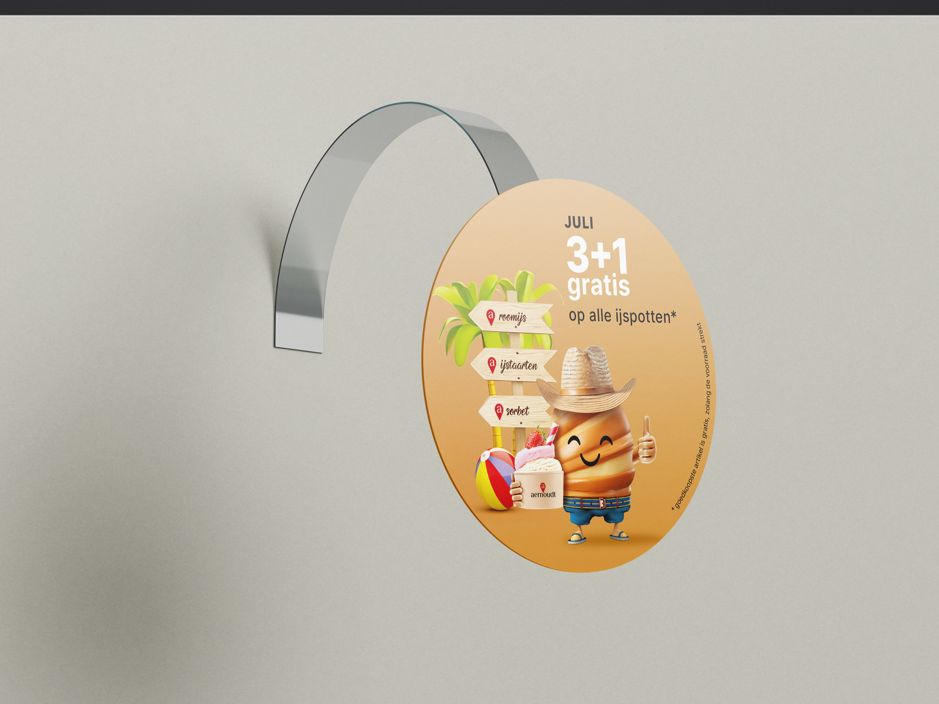
We emphasize Aernoudt's proximity and reliability in a cheerful campaign with mascot 'Aerno' as the central figure. We linked 'Aerno' to a strategic and summer discount campaign on ice cream and ice cream cakes, creating a playful summer campaign with online images as well as wall and window stickers, sidewalk signs and wobblers to introduce the seasonal assortment. In this way, we combine the power of an online campaign with a physical shopping experience. An eye-catching window sticker with strong stopping power emphasizes that Aernoudt will remain open throughout the summer, a campaign that appeals to both new and returning customers.
Design promo materials


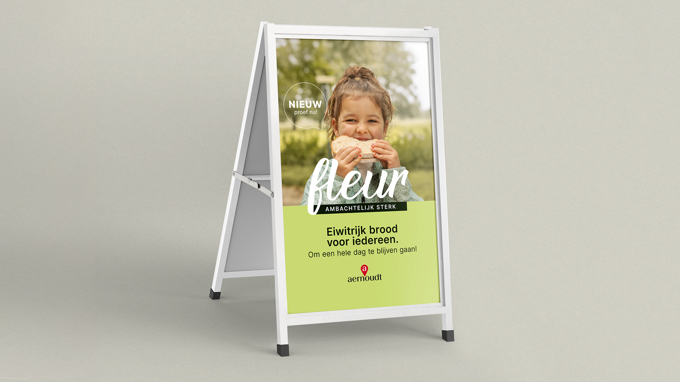
Launch of 'Fleur': innovation meets tradition
When launching “Fleur,” Aernoudt's new high-protein bread, we created a campaign that reflects both the product's innovative features and the bakery's deep-rooted traditions. Fleur is more than an ordinary bread; it is made with locally grown beans, offering a sustainable and nutritious choice for young and old. We developed a campaign that highlights the human and local connection of this product, with authentic stories and imagery that highlight the bread's quality and origins.
Brand design tools

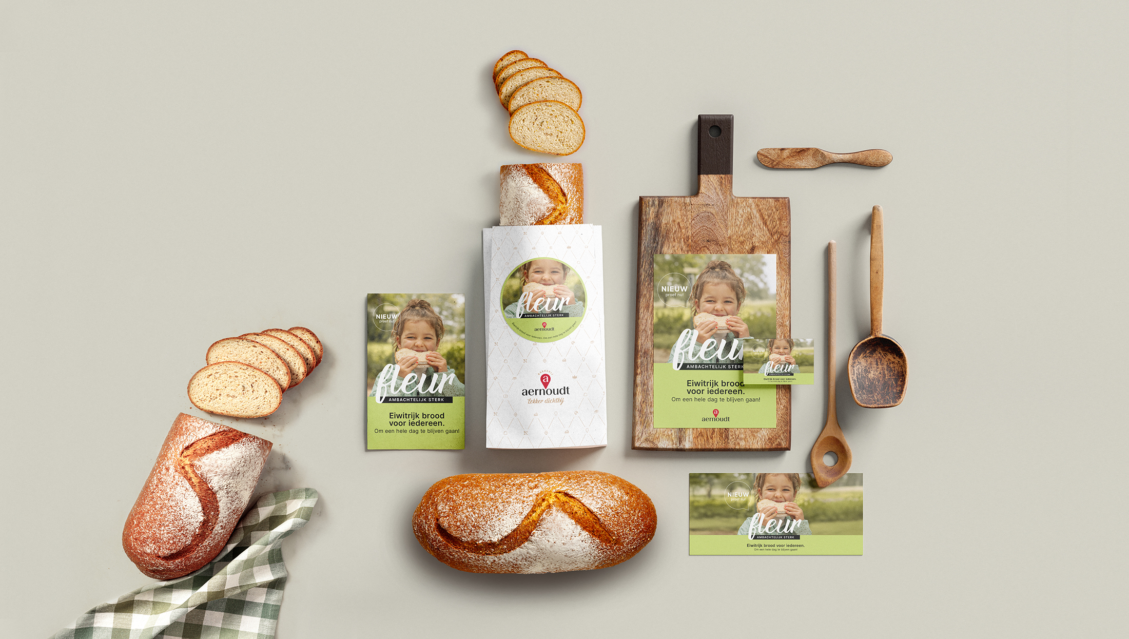
The campaign was further supported with a wide range of promotional materials, including a promotional video, bread bag stickers, sidewalk signs and social media posts.
Promo material

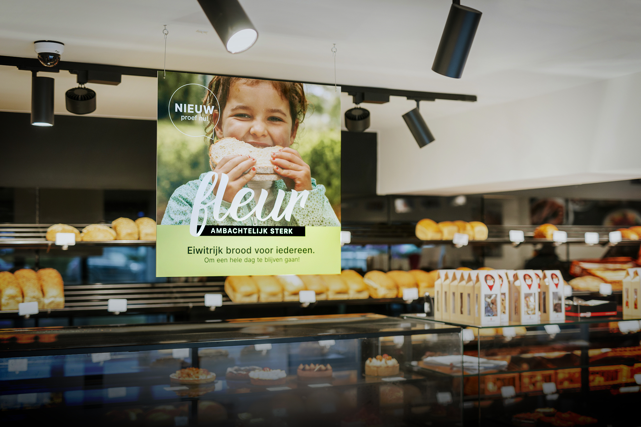
The multichannel approach ensures that Fleur is not just a product, but an experience for consumers.
End-of-year brochure

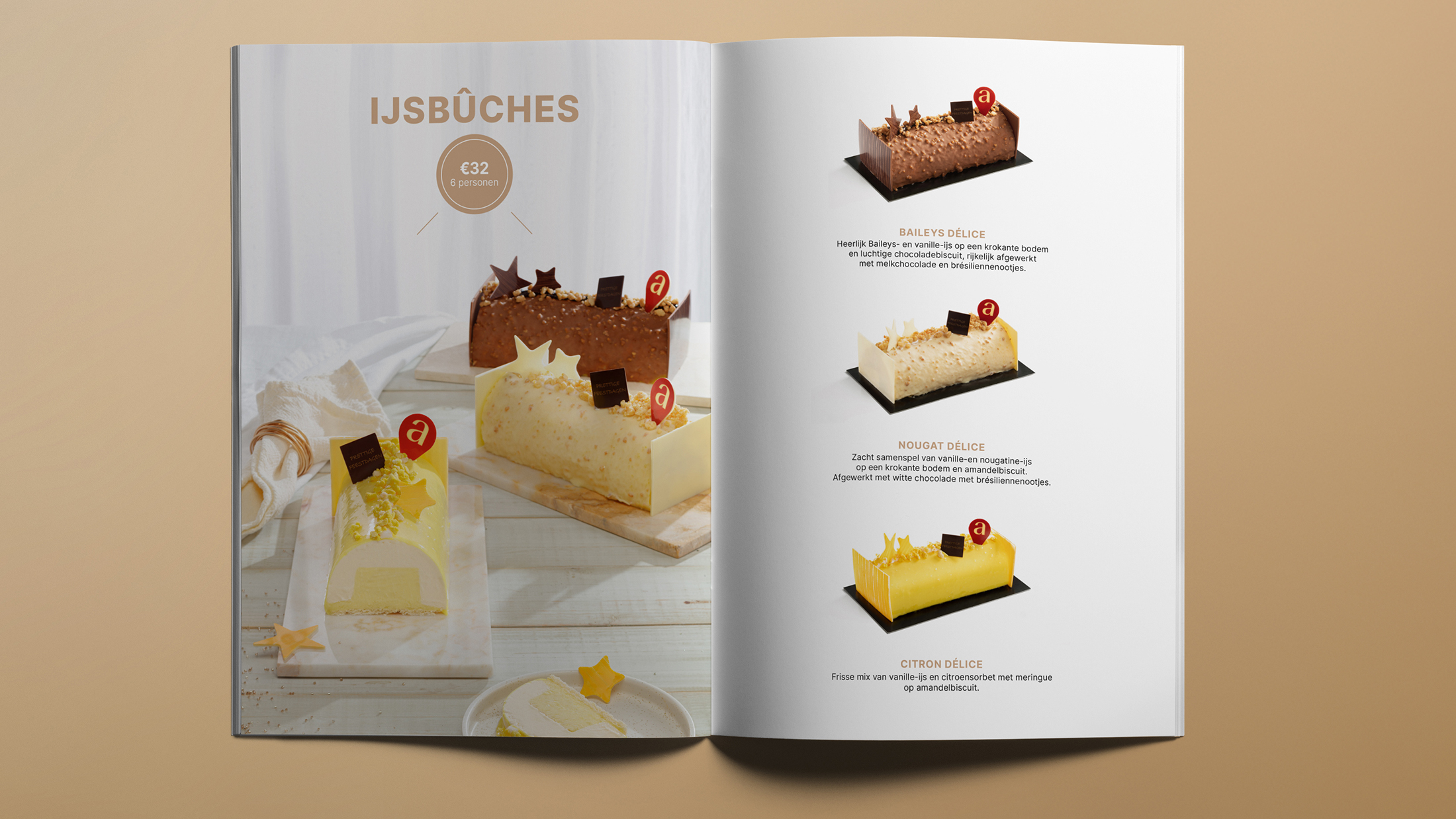
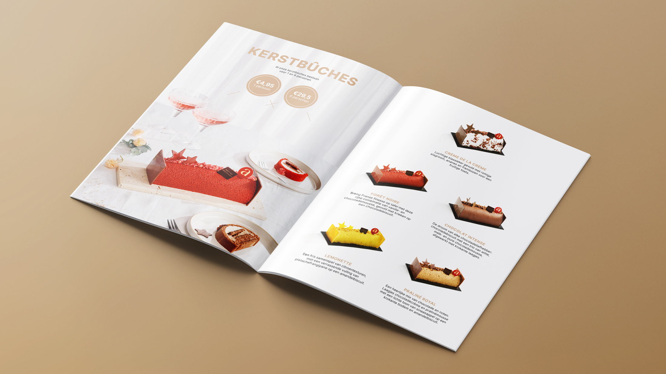

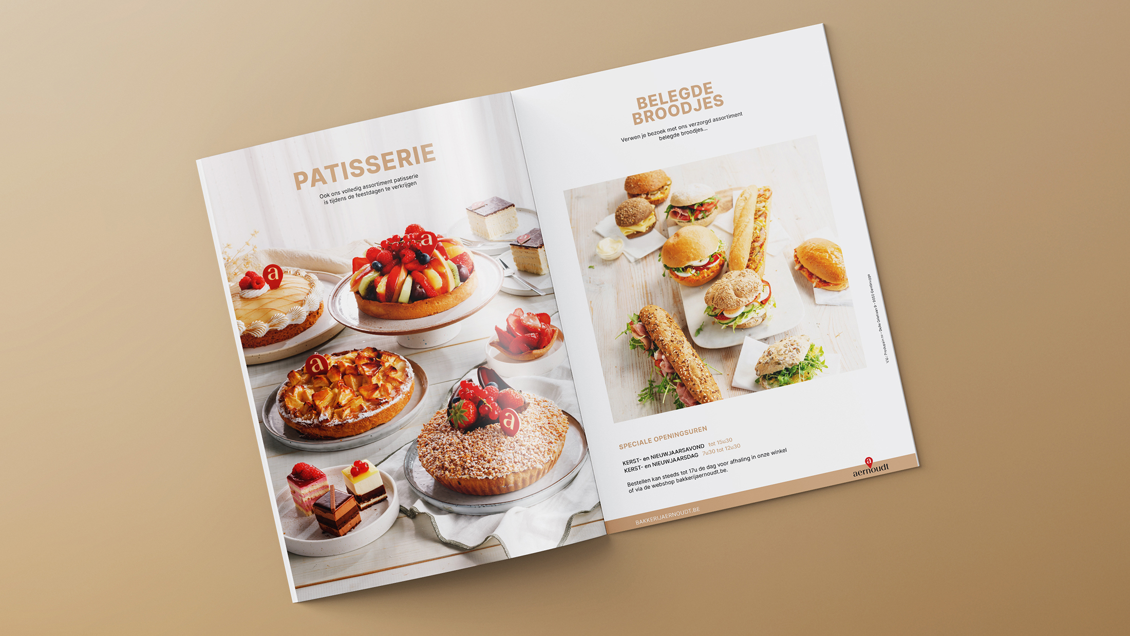
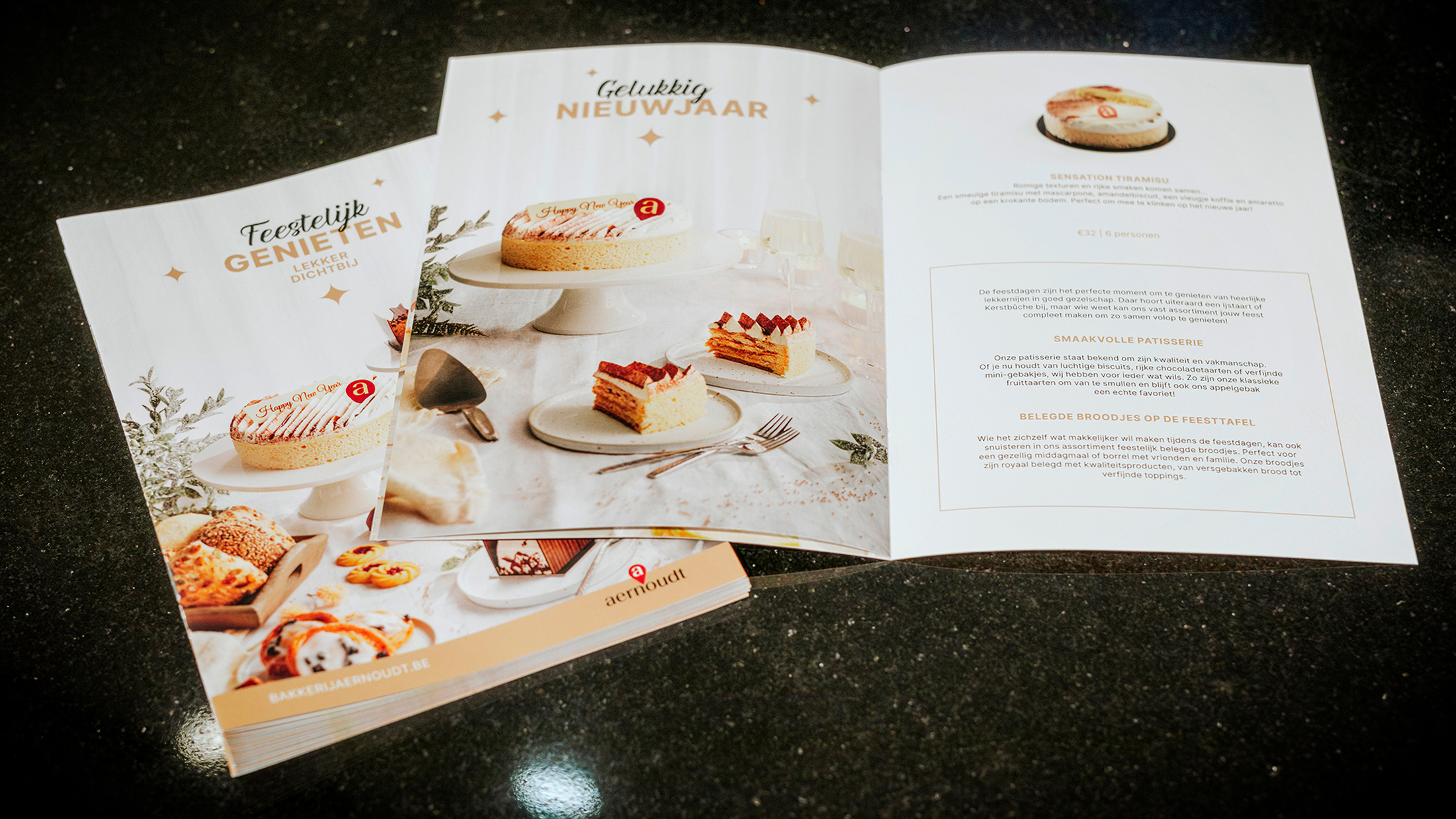
The end-of-year brochure: door-to-door campaigns work!
The Communicationhouse took on the complete realization of Aernoudt's end-of-year brochure: from photography and design to printing and distribution. With a targeted bus-to-bus campaign, we reached the desired target group effectively and locally.
The neat layout, entirely in line with the renewed branding, presents the party assortment to a wide audience. By targeted targeting, we ensure maximum visibility in households close by. This allows customers to select their favorite items from the end-of-year assortment in advance.
This approach optimally supports the regional sales points. Offline leaflets and distribution campaigns remain a proven formula for success!
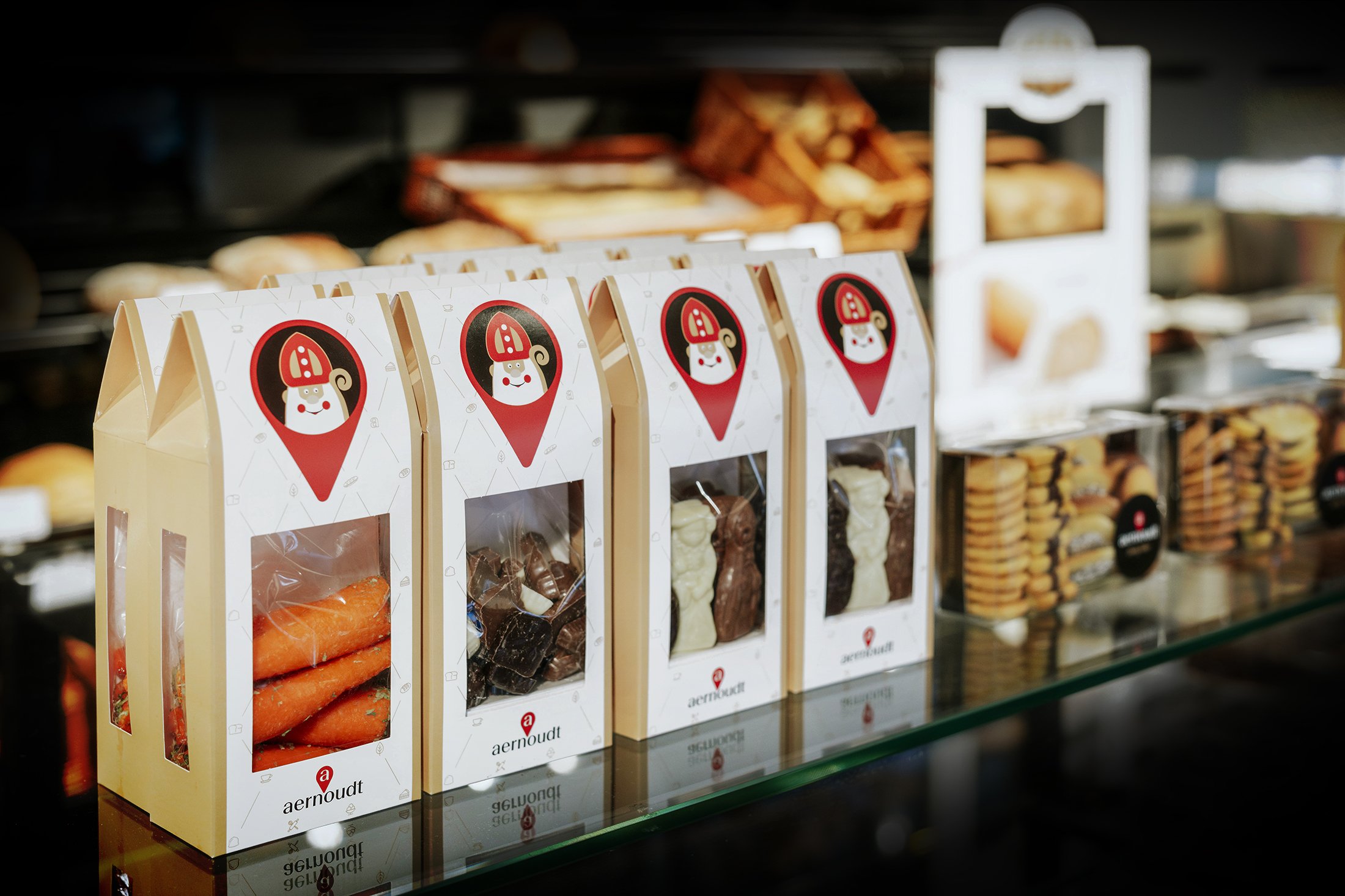
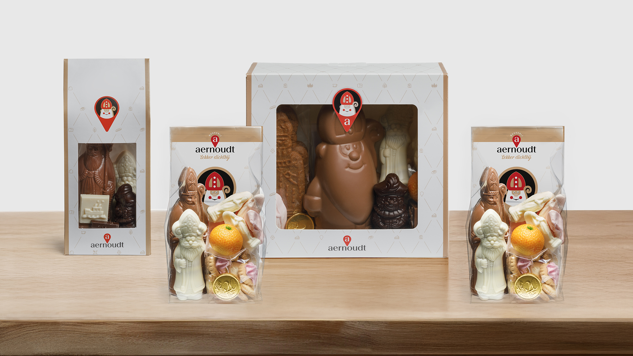
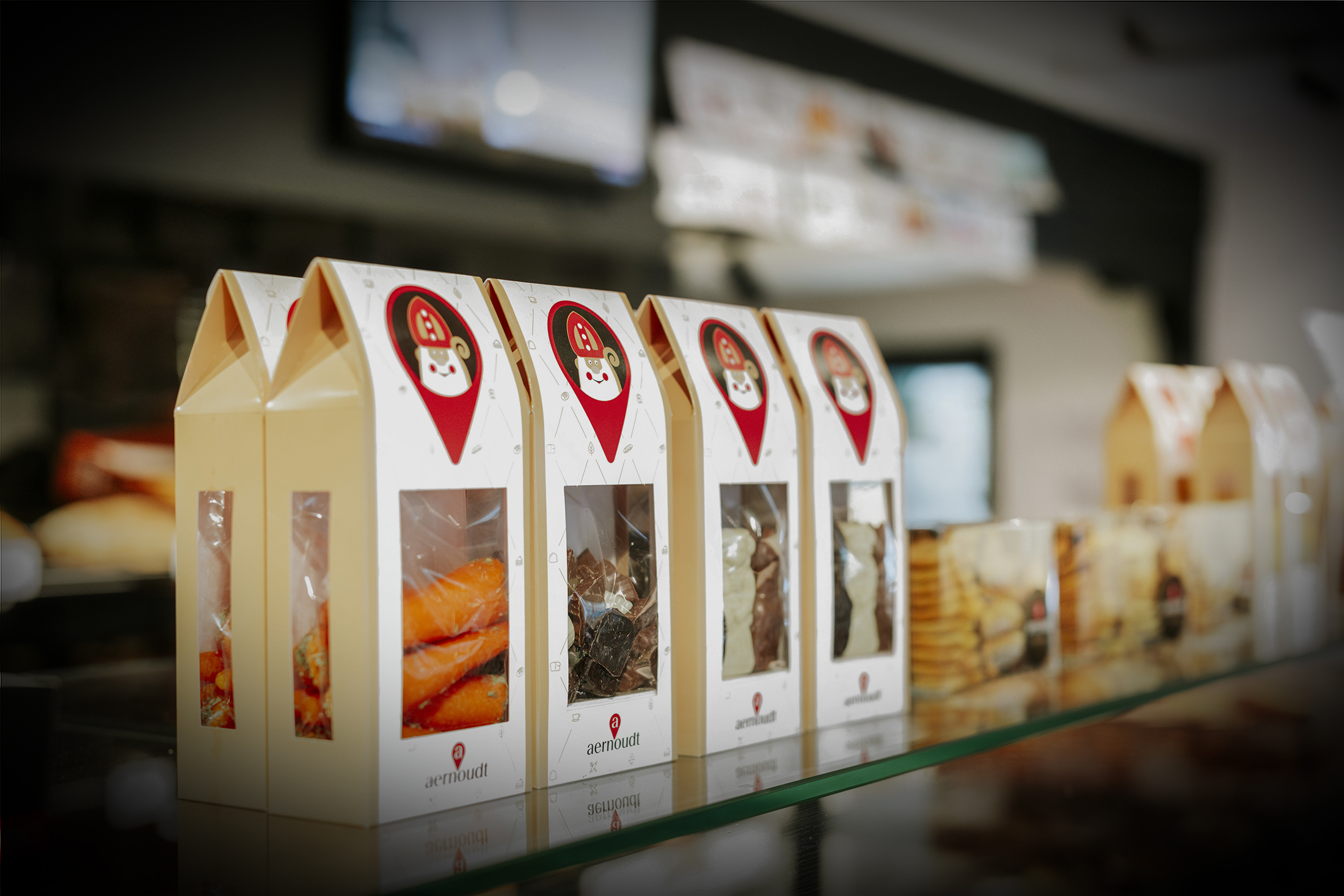
Packaging design: communication with character/
A strong brand experience does not end in the bakery itself. By focusing on packaging that exudes warmth, authenticity and originality, we bring Aernout's DNA to East and West Flanders households. Packaging is not only functional, but also tells a story. We implemented Aernoudt's corporate identity in every detail in the Saint Nicholas packaging, confectionery... to create a consistent and recognizable shopping experience. The packaging was designed with a clear message: Aernoudt is always nearby. This with the 'marker' as a recurring symbol.
Also looking for a powerful campaign that works for your brand? Our team of strategists, designers, photographers and videographers are ready to bring your story to life.
Saint Nicholas packaging
Do you have a question or
would you like additional information?